
Intro
About Southwest
Southwest Airlines is one of the three largest domestic airlines in the United States, known for its focus on efficiency, flexibility, and usability—key elements that are central to its brand identity. The Southwest website serves multiple purposes, including advertising sales, assisting customers with trip planning, and enabling the seamless booking of flights and transportation. The website's design prioritizes ease of use and intuitive navigation, ensuring that users can quickly access and book their desired transportation options, with a primary focus on air travel. This user-centric approach enhances the overall customer experience, streamlining the journey from planning to booking.
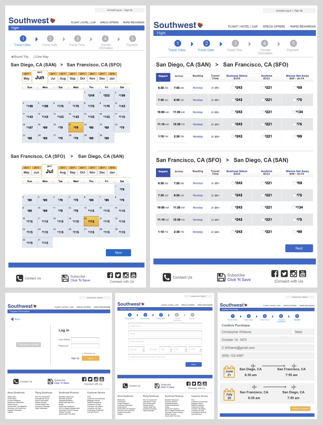
This project involved a UX improvement proposal for the Southwest Airlines website. As both a UX designer and a Southwest customer, I identified that the checkout process was overwhelming for users, with too much information presented on a single page. To address this issue, I designed a simplified, step-by-step checkout flow. Each step was clearly numbered, with steps turning blue once completed, allowing users to easily navigate between them. In the final confirmation step, itinerary details were displayed clearly, providing a clean and straightforward summary. This design aimed to enhance user experience by reducing cognitive load and improving the overall clarity and flow of the checkout process.
Identifying the Problem
Southwest Airlines is primarily chosen by customers for its competitive pricing among domestic airlines. Upon visiting the website, users are greeted with an engaging splash page that prominently features a flight search function, positioned directly beneath an attractive header. Below the search bar, users can explore special offers, along with internal advertisements for car rentals, destinations, and upgrades for faster services at an additional cost. The main goal for most visitors is to book a new ticket, followed by checking or modifying existing bookings.
The website effectively highlights its core purpose—flight search—by placing it front and center with clear typography and a consistent color scheme, making it easy for users to locate. When users enter their search details, they are directed to the flight search results page. However, it is the subsequent pages, where users interact with flight options and finalize bookings, that warrant closer attention for potential UX improvements.
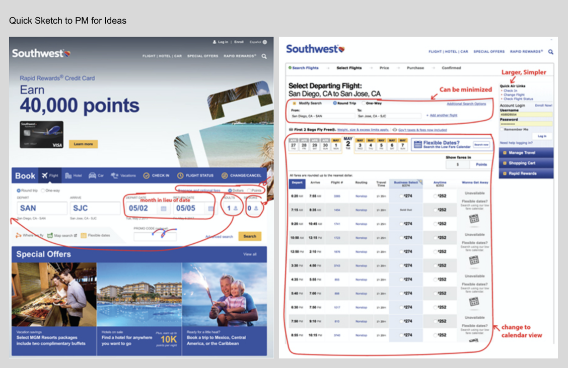
1. Flight Search
To further streamline the user experience, the homepage should be simplified to include only the essential fields for departure, arrival, and month selection. A simple, easy-to-find login button should be added to the usual footer links. Additionally, internal advertisements should be minimized to avoid taking up valuable screen space while users scroll.
After users input their basic search criteria, the page should seamlessly transition into a calendar view, displaying the lowest ticket prices for each day of the month. This would eliminate the need for navigating through multiple screens to explore flexible dates and prices, enabling users to quickly assess their options and choose based on both price and flexibility.
By condensing the search process into two intuitive steps—using a calendar to visualize availability rather than a traditional table—users will find it easier to make informed decisions. If the user’s travel dates are inflexible, they can simply select their preferred dates, disregarding price, or alternatively, adjust their dates based on price availability.
Currently, the separate search for flexible dates feels redundant and adds complexity. A more transparent approach would clearly communicate to users that they have the option to choose flexible dates for a potentially better fare or select fixed dates at a higher price, providing them with a clearer understanding of their choices.
2. Flight Confirmation
The confirmation page currently presents a cluttered, ambiguous layout that is difficult to navigate. Flight details are presented in a table with small typography, which makes it challenging for users to quickly scan the information. Replacing these small text elements with intuitive icons would allow users to glance at the content more easily, improving overall readability.
Additionally, extraneous information at the bottom of the page should be relocated to a separate link or placed at the bottom of the page, as it currently disrupts the flow of the confirmation section. This additional content makes the page feel cluttered and disorganized.
To enhance clarity, the final price should be prominently displayed directly below the selected dates, with clear, actionable buttons for users to proceed or cancel. The right column, which is currently distracting, should be redesigned or eliminated. It contains duplicate flight information and unnecessary empty space, along with poorly placed login details. Moving this information to the top or bottom of the page would create a cleaner and more focused confirmation section, with pricing displayed front and center.
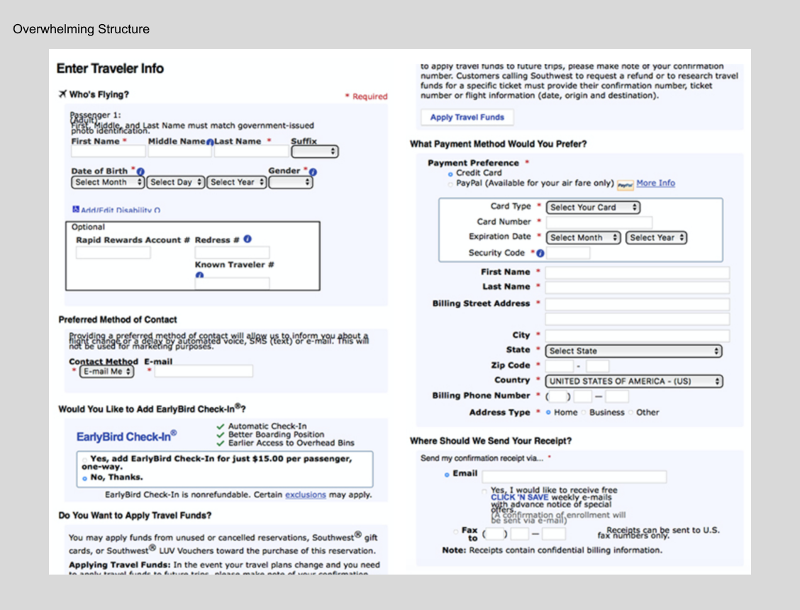
3. User Information and Payment
The user and payment information page requires significant updates to improve the overall user experience. Currently, the page feels overwhelming due to small text, outdated dropdown menus, and scattered sections that are difficult to navigate. There are too many input fields on a single page, creating a cluttered and confusing experience. The layout should be reorganized with a clearer, more intuitive flow, separating sections logically to guide users through the process step by step.
Redundant fields, such as multiple email inputs, should be eliminated to streamline the form. Additionally, the field for entering a previous flight's confirmation number is currently easy to overlook and should be made more prominent. The information is currently presented in disjointed blocks, which could be restructured for better clarity.
One way to improve this page would be to preload vital information directly from the user's account upon login, ideally through a separate popup when the page first loads. This would minimize the amount of data the user needs to manually enter. The input fields should also be larger and more legible, with clear, step-by-step instructions to guide the user through the process.
To enhance usability, each section should be presented in a logical order, with users easily progressing from one step to the next. All extraneous information can be moved to the bottom of the page, reducing distractions and ensuring the focus remains on the essential fields. This restructuring would create a more streamlined, user-friendly experience with better flow and improved usability.
Sketch for Ideation:
I proposed a streamlined, step-by-step flow with clear instructions for each required input. Upon logging in, users should not need to re-enter payment or address information, as it can be pre-filled from their account details. This will simplify the process for returning users, allowing them to focus on completing their tasks efficiently. For new users or those without an account, I designed an intuitive onboarding page with prompt boxes to guide them through each step.
The account information section, along with displays of past flights, confirmation numbers, reward points, and associated rewards, should be redesigned for improved clarity and ease of use. By presenting this information in a more intuitive and organized manner, users will be able to quickly find what they need, enhancing their overall experience.
To enhance usability, each section should be presented in a logical order, with users easily progressing from one step to the next. All extraneous information can be moved to the bottom of the page, reducing distractions and ensuring the focus remains on the essential fields. This restructuring would create a more streamlined, user-friendly experience with better flow and improved usability.
Final Delivery
The final product incorporates a step-by-step checkout process, which was informed by user testing. Feedback revealed that users preferred this approach over the original long-scroll layout, as it offered a more manageable and organized experience. They appreciated the ability to easily navigate back and update information, resulting in fewer mistakes during the process. Currently, Southwest Airlines continues to utilize this separated step-by-step checkout system with only minor adjustments, reflecting its success in improving the user experience.
Other Projects
Use below links to explore Iris' other product design projects


